Ontario Health Queue
Creating a Virtual Queue System to streamline emergency room visits and improve patient satisfaction.
Ontario Health Queue
Creating a Virtual Queue System to streamline emergency room visits and improve patient satisfaction.
My Role
Product Thinking, Product Design, Ux Research, Visual Design, Usability testing
Timeline
December 2024 (2 weeks)
Project Background
This project was my very first venture into UX design, created three years ago alongside the famous Google UX Design course. It was an excellent starting point, but my skills have significantly evolved since then. Recognizing the potential of the original idea, I felt it deserved a renewed approach with the expertise I've now acquired.
The app serves as a virtual waiting room for emergency rooms, designed to inform patients about real-time wait times and streamline their hospital visits. My redesign process involved conducting usability studies with the original design, gathering valuable insights that led to targeted enhancements in functionality and user experience.
01
Discover
Review of Original Design
User Surveys and Interviews
Goals Reassessment
02
Define
Requirements Specification
Milestones and Timelines
03
Design
Brainstorming
User flows
Mockups and Prototypes
Iteration
Breakdown of the process

DISCOVER
Understanding the Problem
Real Life Scenario
At the end of 2024, I had to take my dad to the ER because he injured his knee. We searched for different hospitals in our area, but either the wait times were too long, or they didn’t provide any information on ER wait times. Eventually, we decided to go to the closest hospital. I dropped him off at 11:30 PM, and I received a call at 5:58 AM to come pick him up. That’s a six-and-a-half-hour wait.
The core problem is the lack of accessible, real-time information on emergency room wait times, which prevents patients from making informed decisions about where and when to seek care. This information gap often leads to increased stress and potentially worsened medical outcomes as patients waste valuable time searching for the shortest wait.
The Solution
Challenge #1: Patients lack a centralized source for real-time wait times across Ontario, leading to uninformed decision-making during emergencies.

Solution: The app consolidates real-time wait times for all emergency rooms in Ontario into a single, easy-to-use platform, allowing users to make quick and informed decisions on where to seek care.
Challenge #2: Traditional waiting in hospitals can expose patients to health risks and discomfort, especially when facilities are overcrowded.
Solution: The app offers a virtual queuing system, enabling patients to join waitlists remotely and wait in comfort, reducing time spent in physical waiting rooms and minimizing health risks.
Review of Original Design
Roasting my designs from 2021 (from when I was a newbie designer) and spotting improvements.
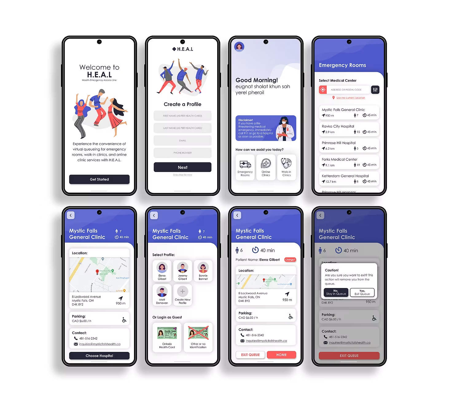
App Name
'H.E.A.L' doesn’t clearly convey its function. Playful tone also feels out of place for a healthcare app.
Landing Page and Greeting
Wordy landing page and greeting slow users down. Remove them for faster access to core features.
Onboarding
Onboarding is incomplete and disruptive. Show wait times first, then ask for details.
Profile Creation
Mandatory profiles don’t fit a sporadic-use emergency app. Make profiles optional.
Graphics
Current visuals feel generic and misaligned with healthcare. Use relevant & purposeful imagery.
UI Design
Bright, playful UI hurts credibility. A cleaner, more restrained design would build trust.
Feedback from Useability Study
For this usability study, I employed a direct observation approach where five participants were individually asked to perform a specific task within the app. The task involved entering a virtual queue at Mystic Falls General Clinic. During these sessions, I silently observed each participant, taking detailed notes on their interactions.
“Okay, yeah, so I think I got through the task, but I don't know, it seems like something was missing.”
“Pretty colours! But I don't know if pretty is the vibe you're going for with this.”
“Oh. That’s it. I thought there would be more questions. It didn't even ask for health card information.
DEFINE
Key Focus Areas
01
Cleaner UI
Simplify the user interface to enhance usability and reduce visual clutter, making it easier for users to navigate and increase credibility.
02
Redesigned User Flow
Refine the user flow to be more seamless, removing unnecessary steps and improving intuitiveness from login to task completion.
03
Patient Intake Form
Develop a more detailed and user-friendly entry process for personal information that increases trust
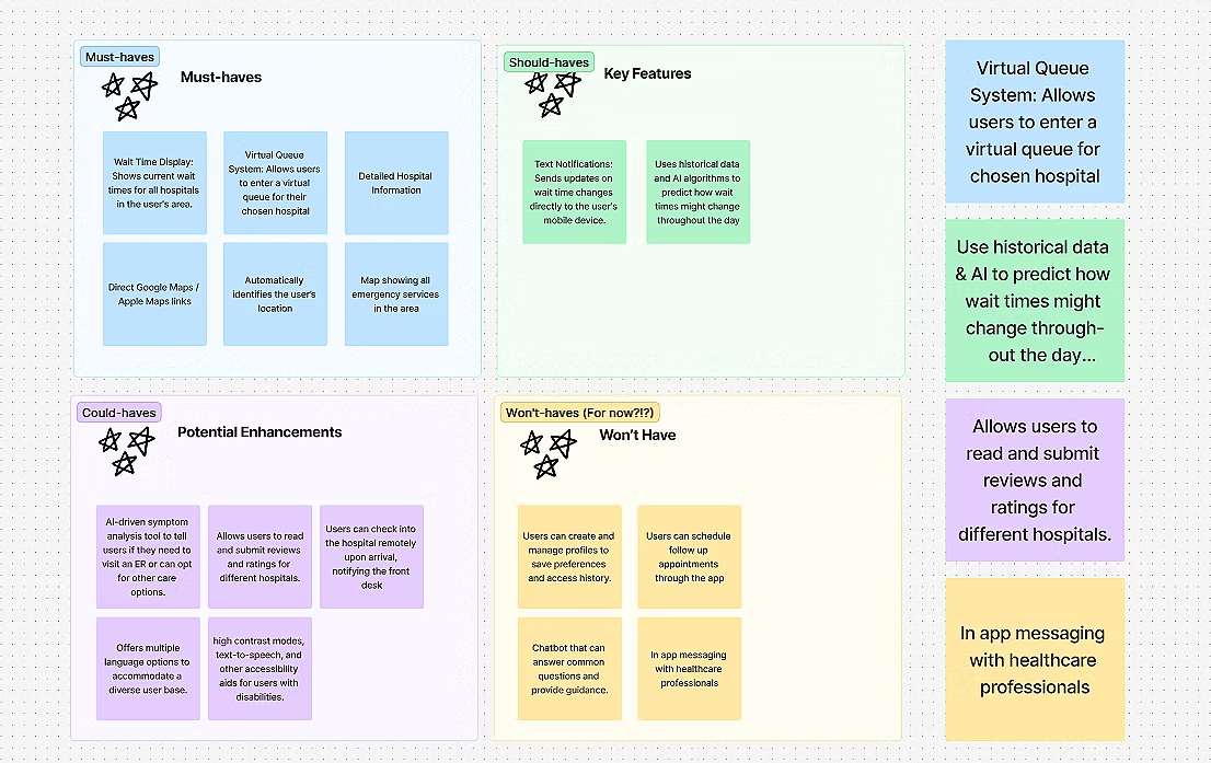
Feature Prioritization
The MoSCoW method chart below categorizes features for the healthcare app. This prioritization ensures that every included feature directly addresses essential healthcare needs and user requirements, crucial for maintaining focus and effectiveness in a healthcare setting.
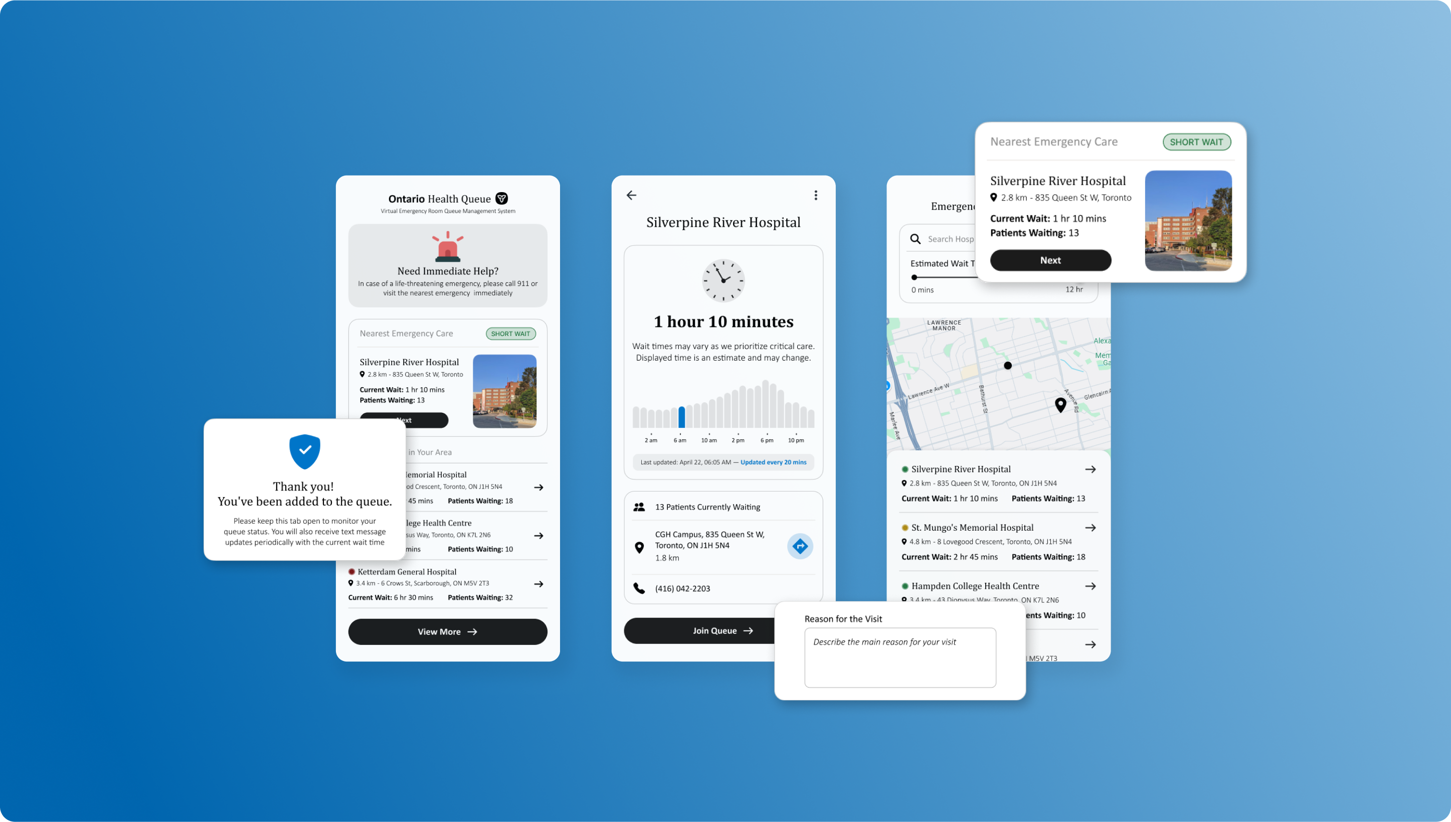
FINAL DESIGN
Revisiting User Flows
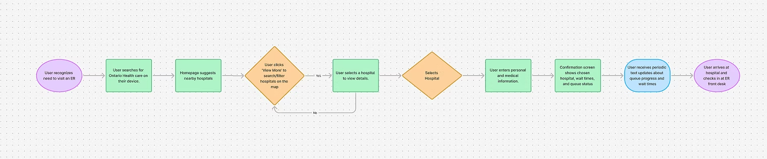
Is this flow too simple?
Yes, and that’s intentional. As a healthcare app designed for users in moments of stress or urgency, simplicity is essential to ensure that users can quickly and easily navigate through the process without confusion or unnecessary complexity.
FINAL DESIGNS
Lets connect!
Resume


Ontario Health Queue
Creating a Virtual Queue System to streamline emergency room visits and improve patient satisfaction.
My Role
Product Thinking, Product Design, Ux Research, Visual Design, Usability testing
Timeline
December 2024 (2 weeks)
Project Background
This project was my very first venture into UX design, created three years ago alongside the famous Google UX Design course. It was an excellent starting point, but my skills have significantly evolved since then. Recognizing the potential of the original idea, I felt it deserved a renewed approach with the expertise I've now acquired.
The app serves as a virtual waiting room for emergency rooms, designed to inform patients about real-time wait times and streamline their hospital visits. My redesign process involved conducting usability studies with the original design, gathering valuable insights that led to targeted enhancements in functionality and user experience.
01
Discover
Review of Original Design
User Surveys and Interviews
Goals Reassessment
02
Define
Requirements Specification
Milestones and Timelines
03
Design
Brainstorming
User flows
Mockups and Prototypes
Iteration
Breakdown of the process
DISCOVER
Understanding the Problem
Real Life Scenario
At the end of 2024, I had to take my dad to the ER because he injured his knee. We searched for different hospitals in our area, but either the wait times were too long, or they didn’t provide any information on ER wait times. Eventually, we decided to go to the closest hospital. I dropped him off at 11:30 PM, and I received a call at 5:58 AM to come pick him up. That’s a six-and-a-half-hour wait.
The core problem is the lack of accessible, real-time information on emergency room wait times, which prevents patients from making informed decisions about where and when to seek care. This information gap often leads to increased stress and potentially worsened medical outcomes as patients waste valuable time searching for the shortest wait.
The Solution
Challenge #1: Patients lack a centralized source for real-time wait times across Ontario, leading to uninformed decision-making during emergencies.
Solution: The app consolidates real-time wait times for all emergency rooms in Ontario into a single, easy-to-use platform, allowing users to make quick and informed decisions on where to seek care.
Challenge #2: Traditional waiting in hospitals can expose patients to health risks and discomfort, especially when facilities are overcrowded.
Solution: The app offers a virtual queuing system, enabling patients to join waitlists remotely and wait in comfort, reducing time spent in physical waiting rooms and minimizing health risks.
Review of Original Design
Roasting my designs from 2021 (from when I was a newbie designer) and spotting improvements.
App Name
'H.E.A.L' doesn’t clearly convey its function. Playful tone also feels out of place for a healthcare app.
Landing Page and Greeting
Wordy landing page and greeting slow users down. Remove them for faster access to core features.
Onboarding
Onboarding is incomplete and disruptive. Show wait times first, then ask for details.
Profile Creation
Mandatory profiles don’t fit a sporadic-use emergency app. Make profiles optional.
Graphics
Current visuals feel generic and misaligned with healthcare. Use relevant & purposeful imagery.
UI Design
Bright, playful UI hurts credibility. A cleaner, more restrained design would build trust.
Feedback from Useability Study
For this usability study, I employed a direct observation approach where five participants were individually asked to perform a specific task within the app. The task involved entering a virtual queue at Mystic Falls General Clinic. During these sessions, I silently observed each participant, taking detailed notes on their interactions.
“Okay, yeah, so I think I got through the task, but I don't know, it seems like something was missing.”
“Pretty colours! But I don't know if pretty is the vibe you're going for with this.”
“Oh. That’s it. I thought there would be more questions. It didn't even ask for health card information.
DEFINE
Key Focus Areas
01
Cleaner UI
Simplify the user interface to enhance usability and reduce visual clutter, making it easier for users to navigate and increase credibility.
02
Redesigned User Flow
Refine the user flow to be more seamless, removing unnecessary steps and improving intuitiveness from login to task completion.
03
Patient Intake Form
Develop a more detailed and user-friendly entry process for personal information that increases trust
Feature Prioritization
The MoSCoW method chart below categorizes features for the healthcare app. This prioritization ensures that every included feature directly addresses essential healthcare needs and user requirements, crucial for maintaining focus and effectiveness in a healthcare setting.
FINAL DESIGN
Revisiting User Flows
Is this flow too simple?
Yes, and that’s intentional. As a healthcare app designed for users in moments of stress or urgency, simplicity is essential to ensure that users can quickly and easily navigate through the process without confusion or unnecessary complexity.
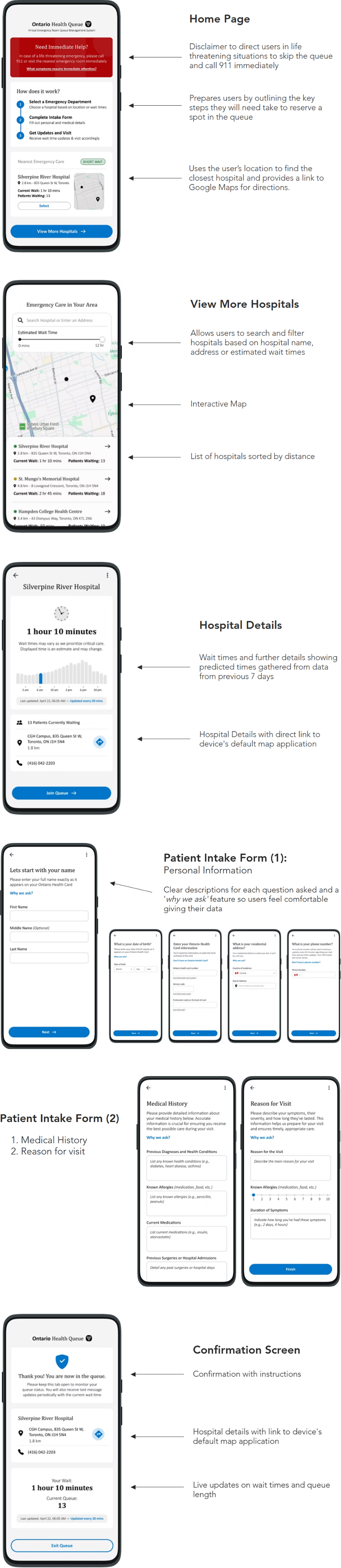
FINAL DESIGNS
Lets connect!
Resume
Ontario Health Queue
Creating a Virtual Queue System to streamline emergency room visits and improve patient satisfaction.
My Role
Product Thinking, Product Design, Ux Research, Visual Design, Usability testing
Timeline
December 2024 (2 weeks)
Project Background
This project was my very first venture into UX design, created three years ago alongside the famous Google UX Design course. It was an excellent starting point, but my skills have significantly evolved since then. Recognizing the potential of the original idea, I felt it deserved a renewed approach with the expertise I've now acquired.
The app serves as a virtual waiting room for emergency rooms, designed to inform patients about real-time wait times and streamline their hospital visits. My redesign process involved conducting usability studies with the original design, gathering valuable insights that led to targeted enhancements in functionality and user experience.
01
Discover
Review of Original Design
User Surveys and Interviews
Goals Reassessment
02
Define
Requirements Specification
Milestones and Timelines
03
Design
Brainstorming
User flows
Mockups and Prototypes
Iteration
Breakdown of the process

DISCOVER
Understanding the Problem
Real Life Scenario
At the end of 2024, I had to take my dad to the ER because he injured his knee. We searched for different hospitals in our area, but either the wait times were too long, or they didn’t provide any information on ER wait times. Eventually, we decided to go to the closest hospital. I dropped him off at 11:30 PM, and I received a call at 5:58 AM to come pick him up. That’s a six-and-a-half-hour wait.
The core problem is the lack of accessible, real-time information on emergency room wait times, which prevents patients from making informed decisions about where and when to seek care. This information gap often leads to increased stress and potentially worsened medical outcomes as patients waste valuable time searching for the shortest wait.
The Solution
Challenge #1: Patients lack a centralized source for real-time wait times across Ontario, leading to uninformed decision-making during emergencies.

Solution: The app consolidates real-time wait times for all emergency rooms in Ontario into a single, easy-to-use platform, allowing users to make quick and informed decisions on where to seek care.
Challenge #2: Traditional waiting in hospitals can expose patients to health risks and discomfort, especially when facilities are overcrowded.
Solution: The app offers a virtual queuing system, enabling patients to join waitlists remotely and wait in comfort, reducing time spent in physical waiting rooms and minimizing health risks.
Review of Original Design
Roasting my designs from 2021 (from when I was a newbie designer) and spotting improvements.
App Name
'H.E.A.L' doesn’t clearly convey its function. Playful tone also feels out of place for a healthcare app.
Landing Page and Greeting
Wordy landing page and greeting slow users down. Remove them for faster access to core features.
Onboarding
Onboarding is incomplete and disruptive. Show wait times first, then ask for details.
Profile Creation
Mandatory profiles don’t fit a sporadic-use emergency app. Make profiles optional.
Graphics
Current visuals feel generic and misaligned with healthcare. Use relevant & purposeful imagery.
UI Design
Bright, playful UI hurts credibility. A cleaner, more restrained design would build trust.
Feedback from Useability Study
For this usability study, I employed a direct observation approach where five participants were individually asked to perform a specific task within the app. The task involved entering a virtual queue at Mystic Falls General Clinic. During these sessions, I silently observed each participant, taking detailed notes on their interactions.
“Okay, yeah, so I think I got through the task, but I don't know, it seems like something was missing.”
“Pretty colours! But I don't know if pretty is the vibe you're going for with this.”
“Oh. That’s it. I thought there would be more questions. It didn't even ask for health card information.
DEFINE
Key Focus Areas
01
Cleaner UI
Simplify the user interface to enhance usability and reduce visual clutter, making it easier for users to navigate and increase credibility.
02
Redesigned User Flow
Refine the user flow to be more seamless, removing unnecessary steps and improving intuitiveness from login to task completion.
03
Patient Intake Form
Develop a more detailed and user-friendly entry process for personal information that increases trust
Feature Prioritization
The MoSCoW method chart below categorizes features for the healthcare app. This prioritization ensures that every included feature directly addresses essential healthcare needs and user requirements, crucial for maintaining focus and effectiveness in a healthcare setting.
FINAL DESIGN
Revisiting User Flows
Is this flow too simple?
Yes, and that’s intentional. As a healthcare app designed for users in moments of stress or urgency, simplicity is essential to ensure that users can quickly and easily navigate through the process without confusion or unnecessary complexity.
FINAL DESIGNS
Lets connect!
Resume
