LCBO Internship | Winter 2023
Building LCBO's anti-theft solution to reduce millions in lost revenue each year and decrease theft in stores.
LCBO Internship | Winter 2023
Building LCBO's anti-theft solution to reduce millions in lost revenue each year and decrease theft in stores.
Timeline
Feb - Apr 2023
Team
1 Product Designer
1 Product Manager
2 Developers
2 Managers
My Role
Product Designer
Design Lead
Company Background
LCBO (Liquor Control Board of Ontario) is a government-owned corporation responsible for the sale, regulation, and distribution of alcoholic beverages, generating billions in revenue each year. LCBO operates 700 retail stores in the province of Ontario, as well as an online platform.
The Problem
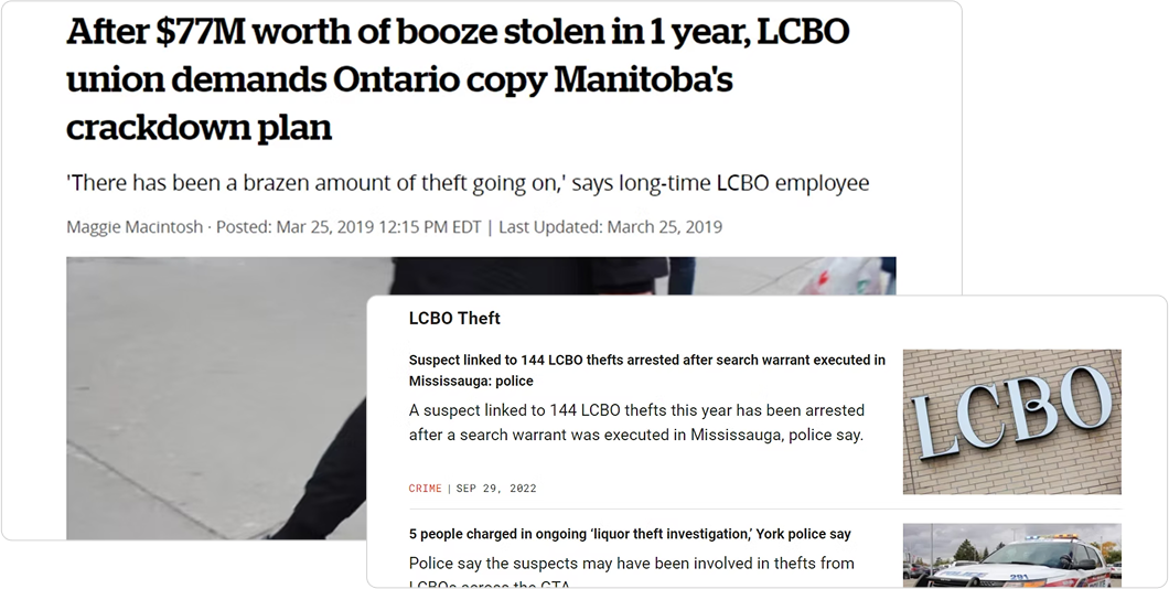
The LCBO is facing a significant problem of increasing theft of select products, which has resulted in a loss of approximately $77 million in 2018. The repeated occurrence of theft of these select products poses a threat to the financial stability, safety and reputation of the LCBO.
The Challenge
How might we reduce theft and ensure safety at LCBO stores?

GOALS
Aligning Stakeholder Needs

Business Goals
Address theft and minimize revenue loss through an innovative technological solution.

Customer Goals
Have a quick, safe, and hassle-free shopping experience.
SUCCESS METRICS
How will we know we’ve succeeded?
Working with stakeholders, we identified key success metrics for this project. Additionally, we aim to ensure that any solution implemented is scalable & adaptable to all LCBO locations, with a focus on mobile usability.
Reduced Theft
Fewer theft incidents & financial losses.
Operational Efficiency
Faster and more accurate store operations.
Improved Safety
Safer environment for customers & employees.
Public Approval
Improved reputation & media coverage.
Customer Satisfaction
Improved experience, as seen from feedback.
Financial Impact
Better revenue retention & ROI.
RESEARCH
Research Findings
Certain product categories, such as popular spirits, and high-demand items, were consistently identified as high-theft targets.
Theft incidents were more frequent in specific neighborhoods, particularly in areas with higher foot traffic and socioeconomic challenges, as well as during peak shopping hours.
Employees reported difficulty balancing customer service and monitoring for theft, highlighting a need for solutions that integrate seamlessly into their workflow without adding complexity.
Customers valued an unobtrusive shopping experience, indicating that overly aggressive security measures could negatively impact their perception of the brand.
Existing security measures, such as cameras and alarms, were reactive rather than preventative, offering limited deterrence against theft.
Research Findings
Pros
Cons
Conversations with Stakeholders
Following discussions with stakeholders, we decided to develop a kiosk that functions as an in-store ordering system.
The goal was to create a user-friendly interface that would allow customers to easily browse, select, and request products, streamlining the shopping experience while reducing theft opportunities. The goal was to create a user-friendly interface that would allow customers to easily browse, select, and request products, streamlining the shopping experience while reducing theft opportunities.
UNDERSTANDING USERS AND GOALS
Balancing Innovation with User Comfort
While developing the in-store requesting kiosk, I recognized that it was going to impose a burden on our customers. However, I made it a priority to keep this in mind throughout the design process, aiming to minimize any inconvenience or challenges they might face.
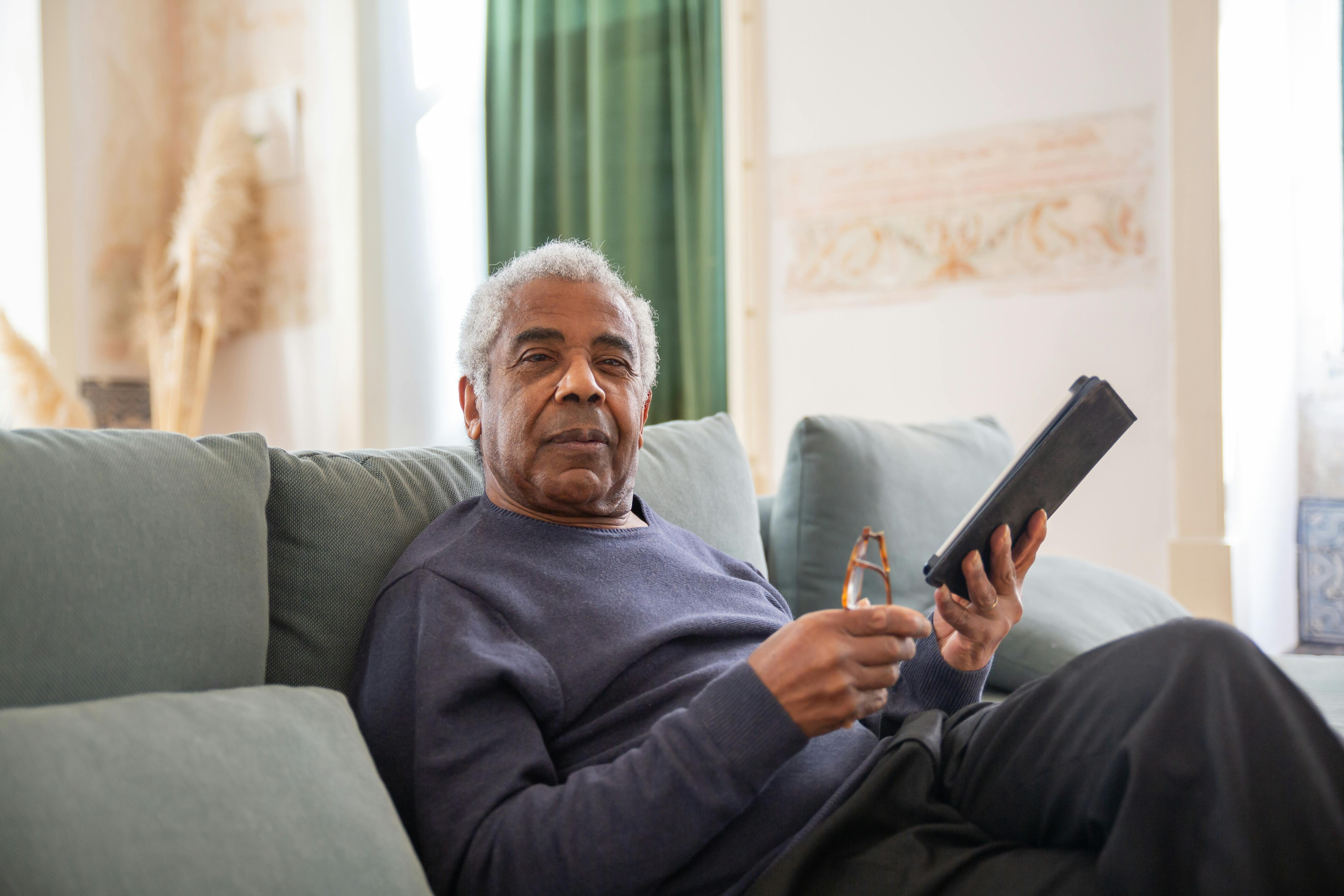
During the project, it was surprising to discover that a significant portion of LCBO's customer base consisted of older individuals who may not be as comfortable with technology. This insight played a crucial role in designing the in-store requesting app. To cater to their needs, I focused on keeping the user interface intuitive and the user flow as straightforward as possible. By prioritizing ease of use, I aimed to make the app accessible and inclusive for all users, regardless of their level of tech-savviness.
Personas
Empathizing with diverse user needs through three distinct personas to guide user-centered design decisions.

Carolina
22 | Customer
Busy university student, enjoys event planning & throwing parties

Goals
Challenges
Terry
71 | Customer
Retired chef who loves sharing love of cooking & making drinks
Goals
Challenges

Alexa
31 | Employee
Employee for 2 years who is used to current work flow

Goals
Challenges
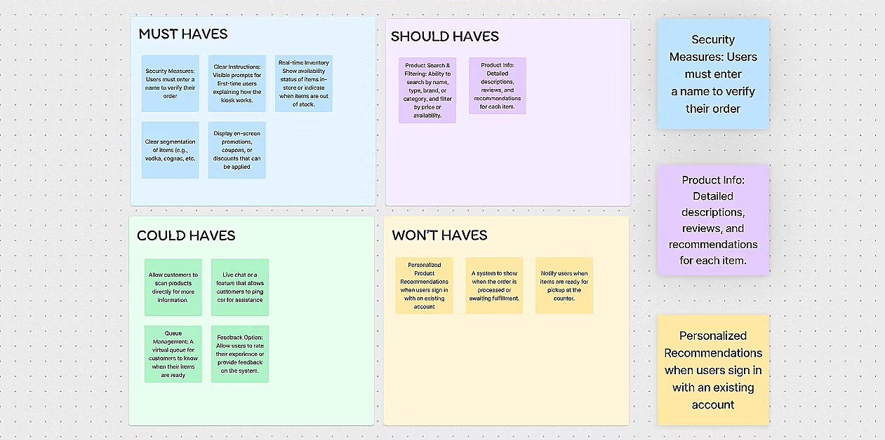
Feature Prioritization
With the Product Manager, we organized a brainstorming session to foster creative solutions and features. This collaborative effort generated a variety of ideas. We then used the MoSCoW method to prioritize and categorize and refine these ideas, focusing on the most impactful concepts for further development.
DEFINE
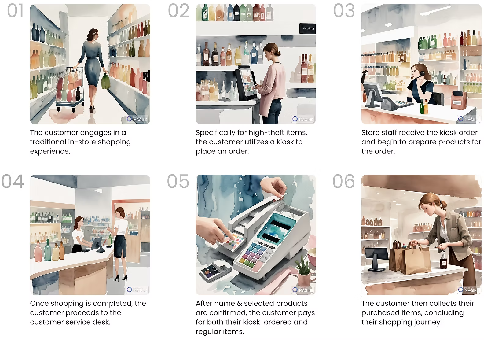
Storyboarding
The storyboard below depicts the customer's journey, which is kept simple on purpose, as we aimed to impose as little burden on our customers as possible.
GETTING INTO DESIGN
First Iteration
In the initial phase, the primary goal was to demonstrate to stakeholders the capability of our team — a team of only interns. Given the time constraints, we had a brief window to produce the first iteration and I was able to create a flow that, while not perfect, initially resonated with our team.
In Version 1.1, I adhered closely to stakeholders' preferences, creating distinct screens and kiosks for each store section, such as cognac, vodka, and scotch. This aligns precisely with their initial vision.
In Version 1.2, I introduced a combined screen where customers could access all three categories. This approach was intended to showcase an alternative perspective and prove the efficiency of a unified screen for customers interested in making in-store orders from multiple categories.
It was a strategic move to present both options, allowing for a more informed comparison and demonstrating the advantages of the unified approach.
Feedback

UI Familiarity: The familiar UI, similar to the e-commerce site, enhanced user experience.
Unified Product Cards: Consolidating product sizes under one card improved accessibility and user experience.
Product Categories: Including all categories on each kiosk improved navigation and selection.

Too many screens: This compromised the quick and efficient nature expected from kiosk interactions
Divergence from E-commerce Site: The kiosk flow was too similar to the e-commerce site, reducing the speed and intuitiveness needed.
Critical Learning
While drawing inspiration and replicating elements from the e-commerce website proved beneficial initially, moving forward, it's important to think outside the box for more innovative solutions.
Revisiting Key Decisions
User Journey Map:
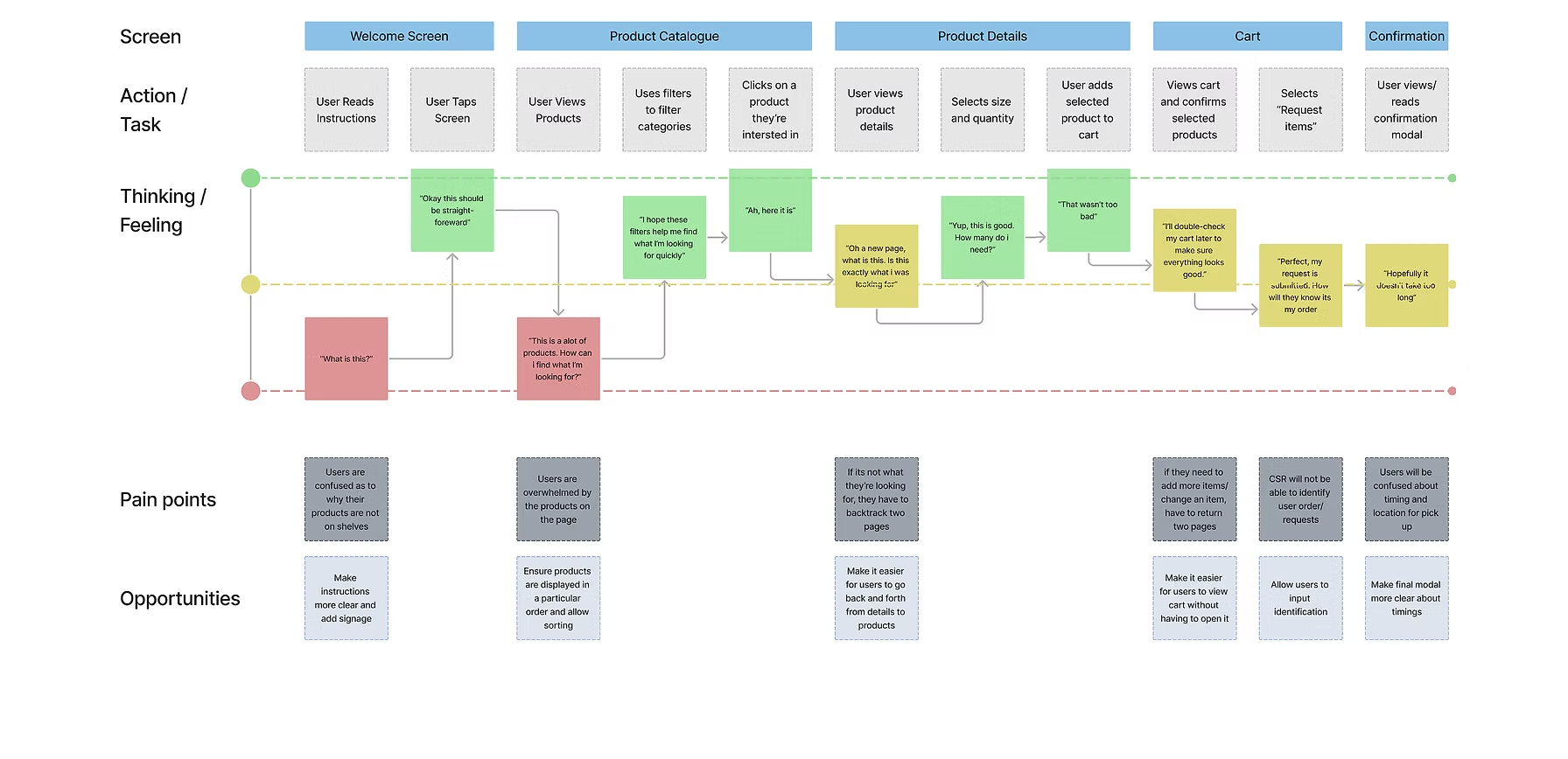
User Flow:
GETTING CLOSE (BUT NOT QUITE)
This iteration garnered positive feedback from stakeholders, with minimal comments. The feedback primarily focused on specific phrases and words rather than the overall flow.
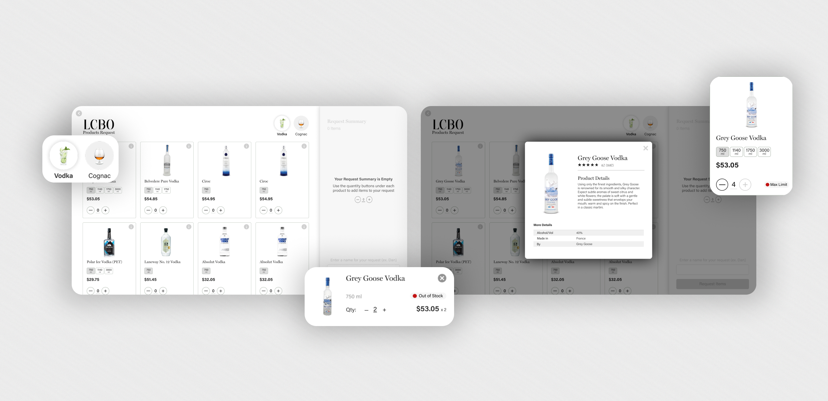
FINAL DESIGNS
Part 1: Application Walkthrough
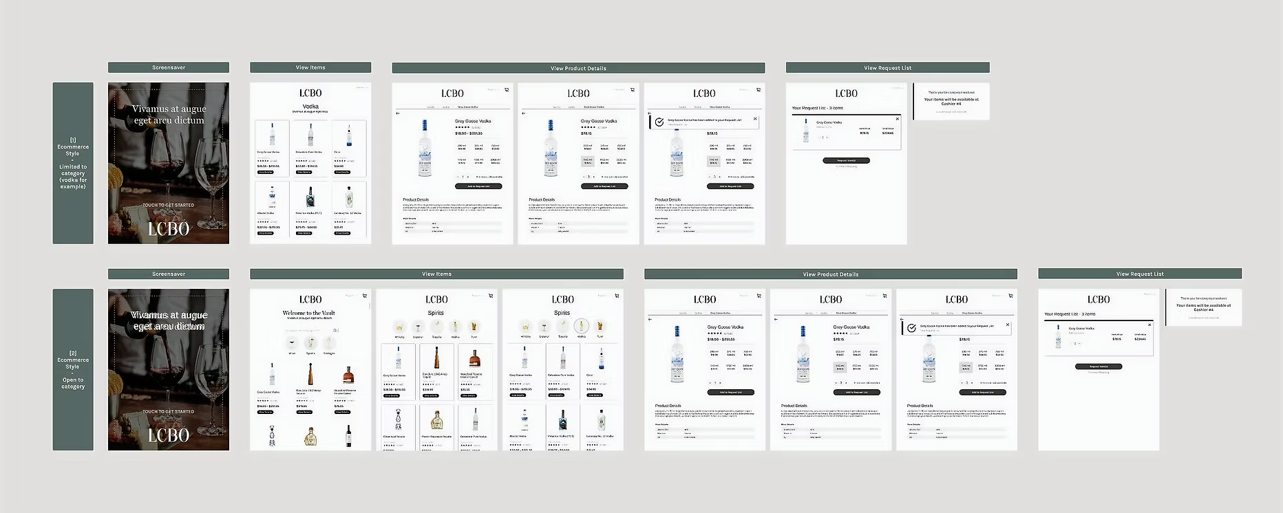
The most notable change in the final design involved transitioning from a portrait to a landscape screen. At beginning of the project, there was uncertainty surrounded the hardware for the kiosk. Ultimately, the chosen hardware and setup dictated the adoption of a landscape screen configuration.

Part 2: Screen Breakdown
Demo Highlights
At the project's conclusion, we conducted a comprehensive demo for the CEO, other C-level executives, and stakeholders, receiving enthusiastic validation. By April 2023, the kiosk was successfully piloted in two stores.
Pictured: The Intern Team —
Bhavraj Atwal (PM), Dhruvi Kapadia (Designer), Mahfuzur Rahman (Dev), Nicholas Lin (Dev)
EMPLOYEE SOLUTIONS
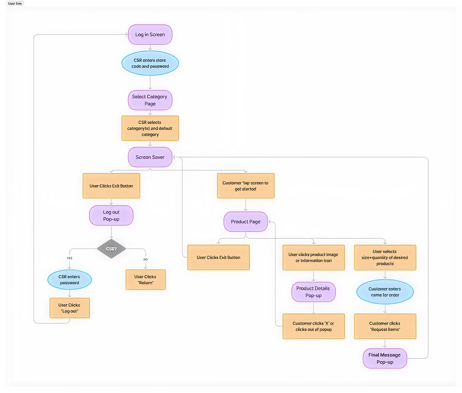
Request Management App: Concept Walkthrough
The in-store ordering system included a secondary application for store staff to receive and fulfill customer orders. This application was designed to enable store staff to receive and fulfill customer orders.
While I began designing screens for this app, the development team later took over. I take pride in my initial designs, which inspired the final app. Though they need further refinement, here’s a quick walkthrough of the concept.
⊹ POST INTERNSHIP UPDATE ⊹
From Pilot to Success: Seeing My Design in Action
My internship ended in April 2023, with the kiosk launching in two pilot stores. Assuming the project hadn’t progressed, I was surprised in July 2024 to see the kiosk in use at a Waterloo store outside the pilot locations. This discovery confirmed the kiosk’s success & broader rollout, filling me with pride knowing my design made an impact.
KEY LEARNINGS
The Power of Confidence 💪
I learned to balance openness with conviction. By standing behind my ideas while welcoming feedback, I grew into a more confident designer.
Breaking Free from Attachment 🌱
Feedback taught me to let go of personal bias. Staying flexible made my work stronger and my process more objective.
Navigating UX and Technical Collaboration 🚀
Working with developers pushed me to adapt my communication and learn technical basics, building stronger collaboration skills.
The four months at LCBO have been incredibly enriching, thanks to an exceptional team. A special shoutout to my fellow interns—Bhavraj Atwal, Nicholas Lin and Mahfuzur Rahman—and to our managers, Danny Ho and Chris Kelly.
The challenges I faced during this time helped me grow as a product designer and reinforced my passion for solving problems through design. I'm excited to continue this journey!
Lets connect!
Resume


LCBO Internship | Winter 2023
Building LCBO's anti-theft solution to reduce millions in lost revenue each year and decrease theft in stores.
Timeline
Feb - Apr 2023
Team
1 Product Designer
1 Product Manager
2 Developers
2 Managers
My Role
Product Designer
Design Lead
Company Background
LCBO (Liquor Control Board of Ontario) is a government-owned corporation responsible for the sale, regulation, and distribution of alcoholic beverages, generating billions in revenue each year. LCBO operates 700 retail stores in the province of Ontario, as well as an online platform.
The Problem
The LCBO is facing a significant problem of increasing theft of select products, which has resulted in a loss of approximately $77 million in 2018. The repeated occurrence of theft of these select products poses a threat to the financial stability, safety and reputation of the LCBO.
The Challenge
How might we reduce theft and ensure safety at LCBO stores?
GOALS
Aligning Stakeholder Needs
Business Goals
Address theft and minimize revenue loss through an innovative technological solution.
Customer Goals
Have a quick, safe, and hassle-free shopping experience.
SUCCESS METRICS
How will we know we’ve succeeded?
Working with stakeholders, we identified key success metrics for this project. Additionally, we aim to ensure that any solution implemented is scalable & adaptable to all LCBO locations, with a focus on mobile usability.
Reduced Theft
Fewer theft incidents & financial losses.
Operational Efficiency
Faster and more accurate store operations.
Improved Safety
Safer environment for customers & employees.
Public Approval
Improved reputation & media coverage.
Customer Satisfaction
Improved experience, as seen from feedback.
Financial Impact
Better revenue retention & ROI.
RESEARCH
Research Findings
Certain product categories, such as popular spirits, and high-demand items, were consistently identified as high-theft targets.
Theft incidents were more frequent in specific neighborhoods, particularly in areas with higher foot traffic and socioeconomic challenges, as well as during peak shopping hours.
Employees reported difficulty balancing customer service and monitoring for theft, highlighting a need for solutions that integrate seamlessly into their workflow without adding complexity.
Customers valued an unobtrusive shopping experience, indicating that overly aggressive security measures could negatively impact their perception of the brand.
Existing security measures, such as cameras and alarms, were reactive rather than preventative, offering limited deterrence against theft.
Research Findings
Pros
Cons
Conversations with Stakeholders
Following discussions with stakeholders, we decided to develop a kiosk that functions as an in-store ordering system.
The goal was to create a user-friendly interface that would allow customers to easily browse, select, and request products, streamlining the shopping experience while reducing theft opportunities. The goal was to create a user-friendly interface that would allow customers to easily browse, select, and request products, streamlining the shopping experience while reducing theft opportunities.
UNDERSTANDING USERS AND GOALS
Balancing Innovation with User Comfort
While developing the in-store requesting kiosk, I recognized that it was going to impose a burden on our customers. However, I made it a priority to keep this in mind throughout the design process, aiming to minimize any inconvenience or challenges they might face.
During the project, it was surprising to discover that a significant portion of LCBO's customer base consisted of older individuals who may not be as comfortable with technology. This insight played a crucial role in designing the in-store requesting app. To cater to their needs, I focused on keeping the user interface intuitive and the user flow as straightforward as possible. By prioritizing ease of use, I aimed to make the app accessible and inclusive for all users, regardless of their level of tech-savviness.
Personas
Empathizing with diverse user needs through three distinct personas to guide user-centered design decisions.
Carolina
22 | Customer
Busy university student, enjoys event planning & throwing parties

Goals
Challenges
Terry
71 | Customer
Retired chef who loves sharing love of cooking & making drinks
Goals
Challenges
Alexa
31 | Employee
Employee for 2 years who is used to current work flow

Goals
Challenges
Feature Prioritization
With the Product Manager, we organized a brainstorming session to foster creative solutions and features. This collaborative effort generated a variety of ideas. We then used the MoSCoW method to prioritize and categorize and refine these ideas, focusing on the most impactful concepts for further development.
DEFINE
Storyboarding
The storyboard below depicts the customer's journey, which is kept simple on purpose, as we aimed to impose as little burden on our customers as possible.
GETTING INTO DESIGN
First Iteration
In the initial phase, the primary goal was to demonstrate to stakeholders the capability of our team — a team of only interns. Given the time constraints, we had a brief window to produce the first iteration and I was able to create a flow that, while not perfect, initially resonated with our team.
In Version 1.1, I adhered closely to stakeholders' preferences, creating distinct screens and kiosks for each store section, such as cognac, vodka, and scotch. This aligns precisely with their initial vision.
In Version 1.2, I introduced a combined screen where customers could access all three categories. This approach was intended to showcase an alternative perspective and prove the efficiency of a unified screen for customers interested in making in-store orders from multiple categories.
It was a strategic move to present both options, allowing for a more informed comparison and demonstrating the advantages of the unified approach.
Feedback
UI Familiarity: The familiar UI, similar to the e-commerce site, enhanced user experience.
Unified Product Cards: Consolidating product sizes under one card improved accessibility and user experience.
Product Categories: Including all categories on each kiosk improved navigation and selection.
Too many screens: This compromised the quick and efficient nature expected from kiosk interactions
Divergence from E-commerce Site: The kiosk flow was too similar to the e-commerce site, reducing the speed and intuitiveness needed.
Critical Learning
While drawing inspiration and replicating elements from the e-commerce website proved beneficial initially, moving forward, it's important to think outside the box for more innovative solutions.
Revisiting Key Decisions
User Journey Map:
User Flow:
GETTING CLOSE (BUT NOT QUITE)
This iteration garnered positive feedback from stakeholders, with minimal comments. The feedback primarily focused on specific phrases and words rather than the overall flow.
FINAL DESIGNS
Part 1: Application Walkthrough
The most notable change in the final design involved transitioning from a portrait to a landscape screen. At beginning of the project, there was uncertainty surrounded the hardware for the kiosk. Ultimately, the chosen hardware and setup dictated the adoption of a landscape screen configuration.
Part 2: Screen Breakdown
Demo Highlights
At the project's conclusion, we conducted a comprehensive demo for the CEO, other C-level executives, and stakeholders, receiving enthusiastic validation. By April 2023, the kiosk was successfully piloted in two stores.
Pictured: The Intern Team —
Bhavraj Atwal (PM), Dhruvi Kapadia (Designer), Mahfuzur Rahman (Dev), Nicholas Lin (Dev)
EMPLOYEE SOLUTIONS
Request Management App: Concept Walkthrough
The in-store ordering system included a secondary application for store staff to receive and fulfill customer orders. This application was designed to enable store staff to receive and fulfill customer orders.
While I began designing screens for this app, the development team later took over. I take pride in my initial designs, which inspired the final app. Though they need further refinement, here’s a quick walkthrough of the concept.
⊹ POST INTERNSHIP UPDATE ⊹
From Pilot to Success: Seeing My Design in Action
My internship ended in April 2023, with the kiosk launching in two pilot stores. Assuming the project hadn’t progressed, I was surprised in July 2024 to see the kiosk in use at a Waterloo store outside the pilot locations. This discovery confirmed the kiosk’s success & broader rollout, filling me with pride knowing my design made an impact.

KEY LEARNINGS
The Power of Confidence 💪
I learned to balance openness with conviction. By standing behind my ideas while welcoming feedback, I grew into a more confident designer.
Breaking Free from Attachment 🌱
Feedback taught me to let go of personal bias. Staying flexible made my work stronger and my process more objective.
Navigating UX and Technical Collaboration 🚀
Working with developers pushed me to adapt my communication and learn technical basics, building stronger collaboration skills.
The four months at LCBO have been incredibly enriching, thanks to an exceptional team. A special shoutout to my fellow interns—Bhavraj Atwal, Nicholas Lin and Mahfuzur Rahman—and to our managers, Danny Ho and Chris Kelly.
The challenges I faced during this time helped me grow as a product designer and reinforced my passion for solving problems through design. I'm excited to continue this journey!
Lets connect!
Resume

LCBO Internship | Winter 2023
Building LCBO's anti-theft solution to reduce millions in lost revenue each year and decrease theft in stores.
Timeline
Feb - Apr 2023
Team
1 Product Designer
1 Product Manager
2 Developers
2 Managers
My Role
Product Designer
Design Lead
Company Background
LCBO (Liquor Control Board of Ontario) is a government-owned corporation responsible for the sale, regulation, and distribution of alcoholic beverages, generating billions in revenue each year. LCBO operates 700 retail stores in the province of Ontario, as well as an online platform.
The Problem
The LCBO is facing a significant problem of increasing theft of select products, which has resulted in a loss of approximately $77 million in 2018. The repeated occurrence of theft of these select products poses a threat to the financial stability, safety and reputation of the LCBO.
The Challenge
How might we reduce theft and ensure safety at LCBO stores?

GOALS
Aligning Stakeholder Needs
Business Goals
Address theft and minimize revenue loss through an innovative technological solution.
Customer Goals
Have a quick, safe, and hassle-free shopping experience.
SUCCESS METRICS
How will we know we’ve succeeded?
Working with stakeholders, we identified key success metrics for this project. Additionally, we aim to ensure that any solution implemented is scalable & adaptable to all LCBO locations, with a focus on mobile usability.
Reduced Theft
Fewer theft incidents & financial losses.
Operational Efficiency
Faster and more accurate store operations.
Improved Safety
Safer environment for customers & employees.
Public Approval
Improved reputation & media coverage.
Customer Satisfaction
Improved experience, as seen from feedback.
Financial Impact
Better revenue retention & ROI.
RESEARCH
Research Findings
Certain product categories, such as popular spirits, and high-demand items, were consistently identified as high-theft targets.
Theft incidents were more frequent in specific neighborhoods, particularly in areas with higher foot traffic and socioeconomic challenges, as well as during peak shopping hours.
Employees reported difficulty balancing customer service and monitoring for theft, highlighting a need for solutions that integrate seamlessly into their workflow without adding complexity.
Customers valued an unobtrusive shopping experience, indicating that overly aggressive security measures could negatively impact their perception of the brand.
Existing security measures, such as cameras and alarms, were reactive rather than preventative, offering limited deterrence against theft.
Research Findings
Pros
Cons
Conversations with Stakeholders
Following discussions with stakeholders, we decided to develop a kiosk that functions as an in-store ordering system.
The goal was to create a user-friendly interface that would allow customers to easily browse, select, and request products, streamlining the shopping experience while reducing theft opportunities. The goal was to create a user-friendly interface that would allow customers to easily browse, select, and request products, streamlining the shopping experience while reducing theft opportunities.
UNDERSTANDING USERS AND GOALS
Balancing Innovation with User Comfort
While developing the in-store requesting kiosk, I recognized that it was going to impose a burden on our customers. However, I made it a priority to keep this in mind throughout the design process, aiming to minimize any inconvenience or challenges they might face.
During the project, it was surprising to discover that a significant portion of LCBO's customer base consisted of older individuals who may not be as comfortable with technology. This insight played a crucial role in designing the in-store requesting app. To cater to their needs, I focused on keeping the user interface intuitive and the user flow as straightforward as possible. By prioritizing ease of use, I aimed to make the app accessible and inclusive for all users, regardless of their level of tech-savviness.
Personas
Empathizing with diverse user needs through three distinct personas to guide user-centered design decisions.
Carolina
22 | Customer
Busy university student, enjoys event planning & throwing parties

Goals
Challenges
Terry
71 | Customer
Retired chef who loves sharing love of cooking & making drinks
Goals
Challenges
Alexa
31 | Employee
Employee for 2 years who is used to current work flow

Goals
Challenges
Feature Prioritization
With the Product Manager, we organized a brainstorming session to foster creative solutions and features. This collaborative effort generated a variety of ideas. We then used the MoSCoW method to prioritize and categorize and refine these ideas, focusing on the most impactful concepts for further development.
DEFINE
Storyboarding
The storyboard below depicts the customer's journey, which is kept simple on purpose, as we aimed to impose as little burden on our customers as possible.
GETTING INTO DESIGN
First Iteration
In the initial phase, the primary goal was to demonstrate to stakeholders the capability of our team — a team of only interns. Given the time constraints, we had a brief window to produce the first iteration and I was able to create a flow that, while not perfect, initially resonated with our team.
In Version 1.1, I adhered closely to stakeholders' preferences, creating distinct screens and kiosks for each store section, such as cognac, vodka, and scotch. This aligns precisely with their initial vision.
In Version 1.2, I introduced a combined screen where customers could access all three categories. This approach was intended to showcase an alternative perspective and prove the efficiency of a unified screen for customers interested in making in-store orders from multiple categories.
It was a strategic move to present both options, allowing for a more informed comparison and demonstrating the advantages of the unified approach.
Feedback
UI Familiarity: The familiar UI, similar to the e-commerce site, enhanced user experience.
Unified Product Cards: Consolidating product sizes under one card improved accessibility and user experience.
Product Categories: Including all categories on each kiosk improved navigation and selection.
Too many screens: This compromised the quick and efficient nature expected from kiosk interactions
Divergence from E-commerce Site: The kiosk flow was too similar to the e-commerce site, reducing the speed and intuitiveness needed.
Critical Learning
While drawing inspiration and replicating elements from the e-commerce website proved beneficial initially, moving forward, it's important to think outside the box for more innovative solutions.
Revisiting Key Decisions
User Journey Map:
User Flow:
GETTING CLOSE (BUT NOT QUITE)
This iteration garnered positive feedback from stakeholders, with minimal comments. The feedback primarily focused on specific phrases and words rather than the overall flow.
FINAL DESIGNS
Part 1: Application Walkthrough
The most notable change in the final design involved transitioning from a portrait to a landscape screen. At beginning of the project, there was uncertainty surrounded the hardware for the kiosk. Ultimately, the chosen hardware and setup dictated the adoption of a landscape screen configuration.

Part 2: Screen Breakdown
Demo Highlights
At the project's conclusion, we conducted a comprehensive demo for the CEO, other C-level executives, and stakeholders, receiving enthusiastic validation. By April 2023, the kiosk was successfully piloted in two stores.
Pictured: The Intern Team —
Bhavraj Atwal (PM), Dhruvi Kapadia (Designer), Mahfuzur Rahman (Dev), Nicholas Lin (Dev)
EMPLOYEE SOLUTIONS
Request Management App: Concept Walkthrough
The in-store ordering system included a secondary application for store staff to receive and fulfill customer orders. This application was designed to enable store staff to receive and fulfill customer orders.
While I began designing screens for this app, the development team later took over. I take pride in my initial designs, which inspired the final app. Though they need further refinement, here’s a quick walkthrough of the concept.
⊹ POST INTERNSHIP UPDATE ⊹
From Pilot to Success: Seeing My Design in Action
My internship ended in April 2023, with the kiosk launching in two pilot stores. Assuming the project hadn’t progressed, I was surprised in July 2024 to see the kiosk in use at a Waterloo store outside the pilot locations. This discovery confirmed the kiosk’s success & broader rollout, filling me with pride knowing my design made an impact.
KEY LEARNINGS
The Power of Confidence 💪
I learned to balance openness with conviction. By standing behind my ideas while welcoming feedback, I grew into a more confident designer.
Breaking Free from Attachment 🌱
Feedback taught me to let go of personal bias. Staying flexible made my work stronger and my process more objective.
Navigating UX and Technical Collaboration 🚀
Working with developers pushed me to adapt my communication and learn technical basics, building stronger collaboration skills.
The four months at LCBO have been incredibly enriching, thanks to an exceptional team. A special shoutout to my fellow interns—Bhavraj Atwal, Nicholas Lin and Mahfuzur Rahman—and to our managers, Danny Ho and Chris Kelly.
The challenges I faced during this time helped me grow as a product designer and reinforced my passion for solving problems through design. I'm excited to continue this journey!
Lets connect!
Resume